Page 72 of Ulysses (Penguin edition) was one I had been eagerly awaiting to interpret for my Colours of Ulysses series. The page is vibrant with colour and sensory imagery — “fire from foxeyes,” “eucalyptus trees,” “orangegroves,” “immense melonfields,” “olives,” “oranges,” “almonds,” “citrons” — all blurred together in a haze of “silver heat.”
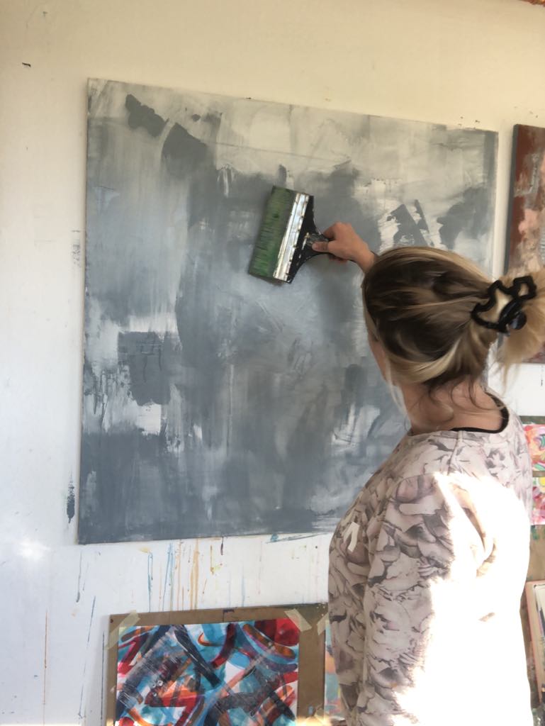
There was so much richness to work with, but that brought its own challenge: I didn’t want the painting to feel like a kaleidoscope. I needed to choose a focus. While the text conjured bold oranges and lush greens, using them equally risked creating an Irish tricolour — not a bad thing, but not the atmosphere I wanted for this piece.
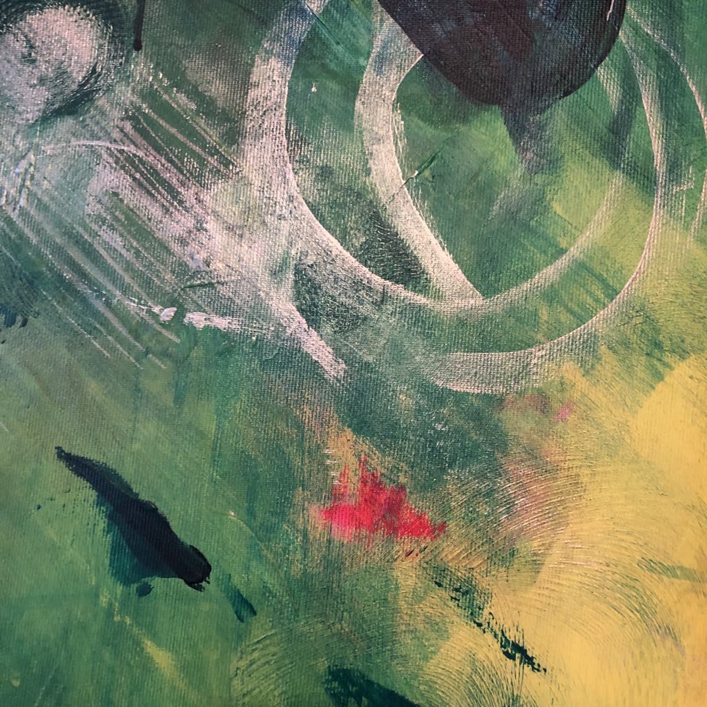
Instead, I let green reign: deep, living, vibrant green — the life-force behind all these fruits. The “immense melonfields” made me think of Hungary too, where I’m lucky enough to see those fields stretch endlessly under the heavy summer sun. I wanted to capture that intense, golden heat — the kind that makes fruit ripen and the earth shimmer — through flashes of almost “sweating” yellow breaking through the layers of green.
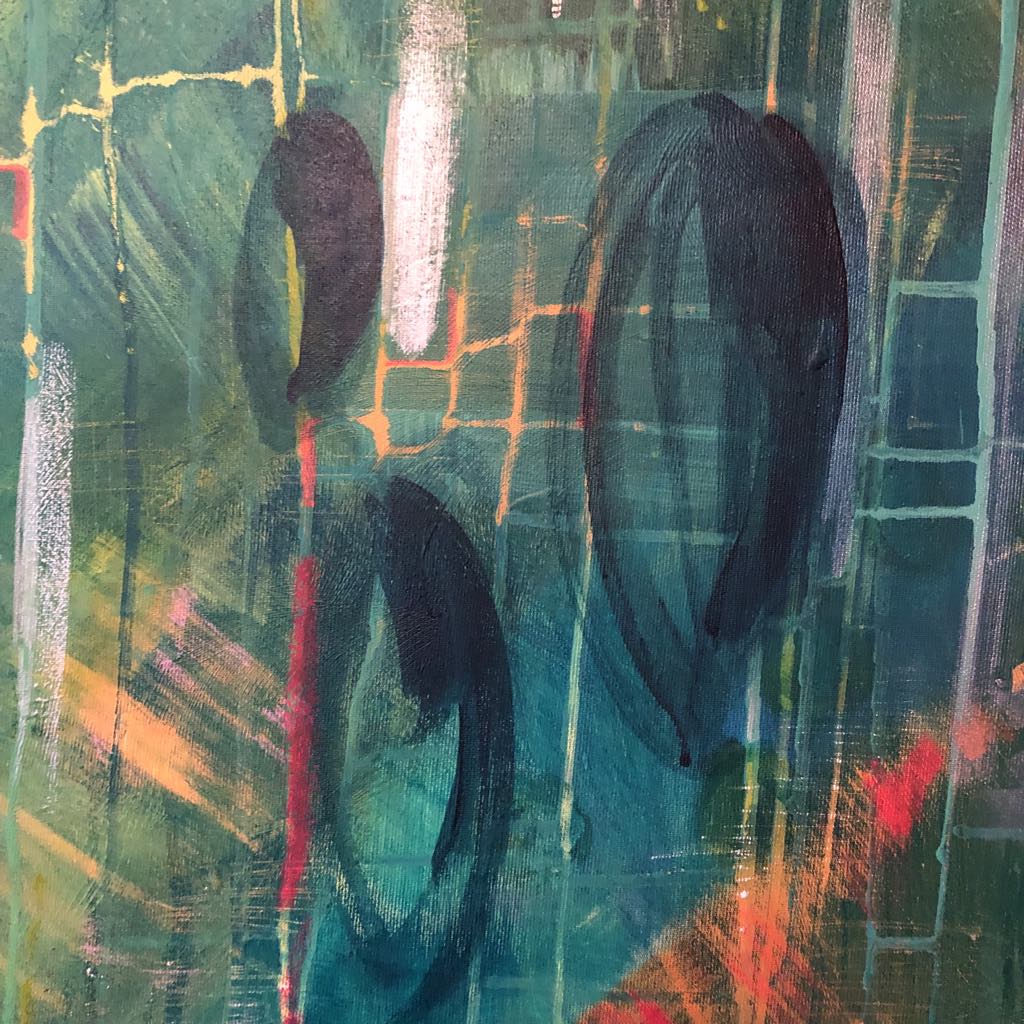
I painted almond and lemon-like shapes, but deliberately resisted creating direct images of the fruits themselves. (Though, after finishing Colours of Ulysses #082, part of me wonders what would have happened if I had leaned into that!) The small but powerful orange marks — the “eager fire from foxeyes” — add energy and movement, like sparks across a lush landscape.
Through layers of paint, I hoped to show glimpses into another world — a hotter, more exotic place beyond the green fields, where citrons and oranges aren’t rare luxuries, but part of the everyday.
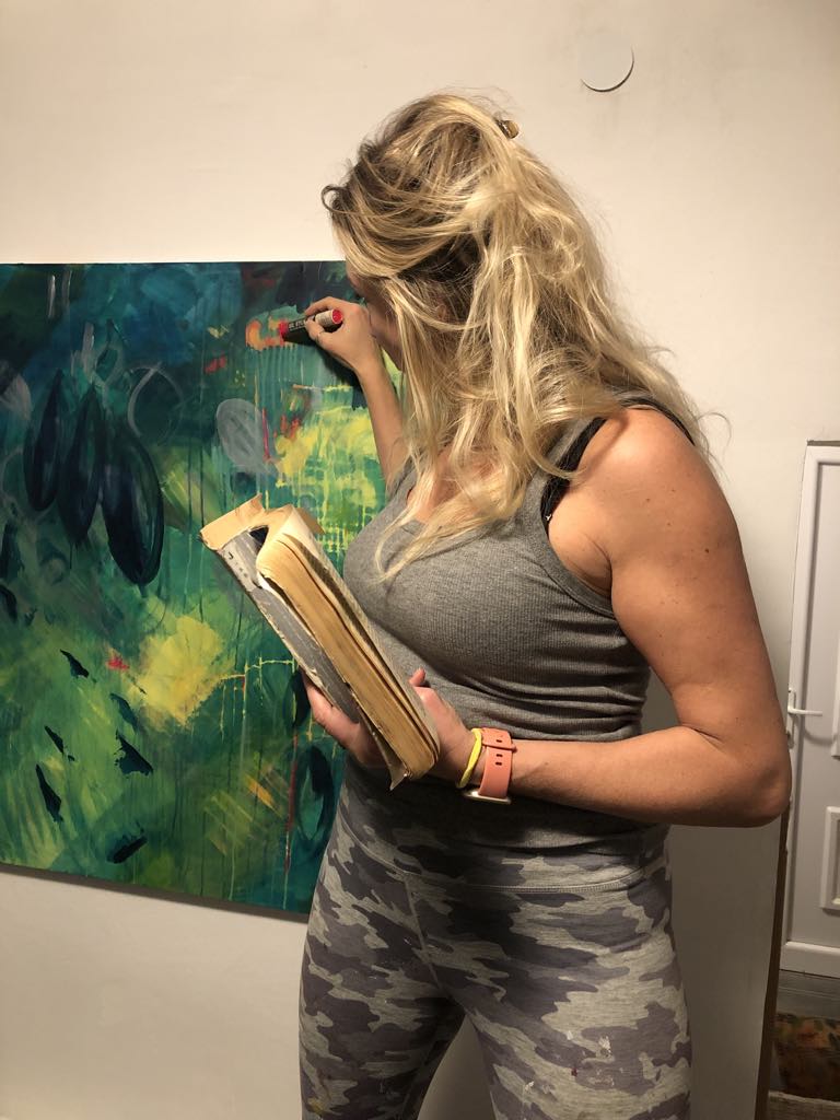
The shimmering “silver heat” winds through the piece in soft, curling shapes, drawing everything together. It isn’t the painting I initially envisioned — it’s richer, more textured, more alive.
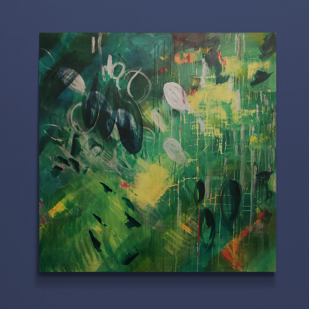
Looking back, months after finishing it, I feel the same deep satisfaction I did the day I finally put down my brush. This page of Ulysses isn’t just about fruit and distant landscapes — it’s about texture, heat, memory, and the calming, meditative power of green.
Where to place it…
Deep shades of green dominate the piece, chosen to reflect the calming, restorative energy that green brings — associated with growth, balance, and renewal in colour psychology.
Perfect for spaces designed for rest and reflection, such as living rooms, bedrooms, reading nooks, or meditation areas, Colours of Ulysses #072 brings a sense of grounded serenity into any environment.
To buy the original of this artwork please click here for the product page
#ColoursOfUlysses #NatalieForresterArt #ArtInspiredByBooks #JamesJoyceUlysses #LiteraryArt #AbstractArt #ContemporaryPainting #CreativeProcess #GreenInArt #SummerHeat #Melonfields #ArtBlog #ArtisticJourney